Dino's Grocery Mart Re-Brand
Original Logo
Dino's Grocery Mart is a local international grocery store. They've been around since the 1970's as a one-stop-shop for all ethnic food needs. Growing up, my family and I would always go to Dino's to get the cosmetic products, and food items that we couldn't get anywhere else.
First Drafts
The first draft of the logo came from a few places. First from Dinos' main values to create and support community, and celebrate culture. In doing this, Dino's has become a comforting spot for immigrants looking for the feeling of their home country. I looked through books, and went on Google Maps' street view to find images of street signs in various countries represented in Dino's.
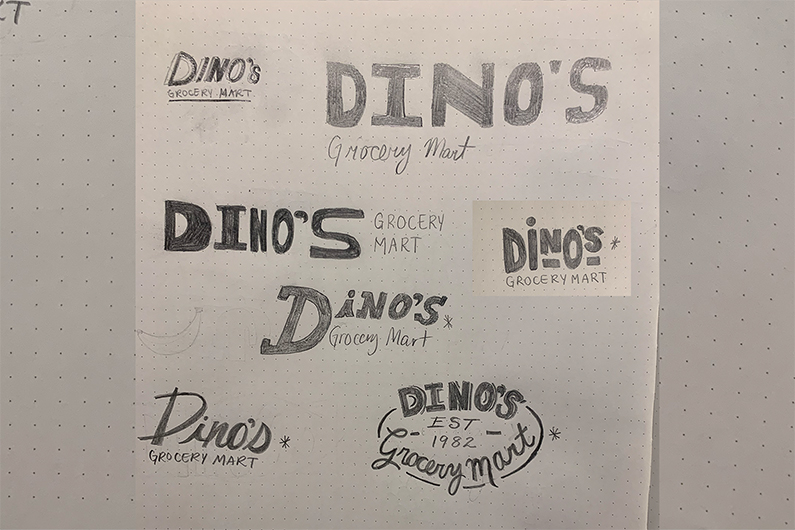
Inital Logo Sketches
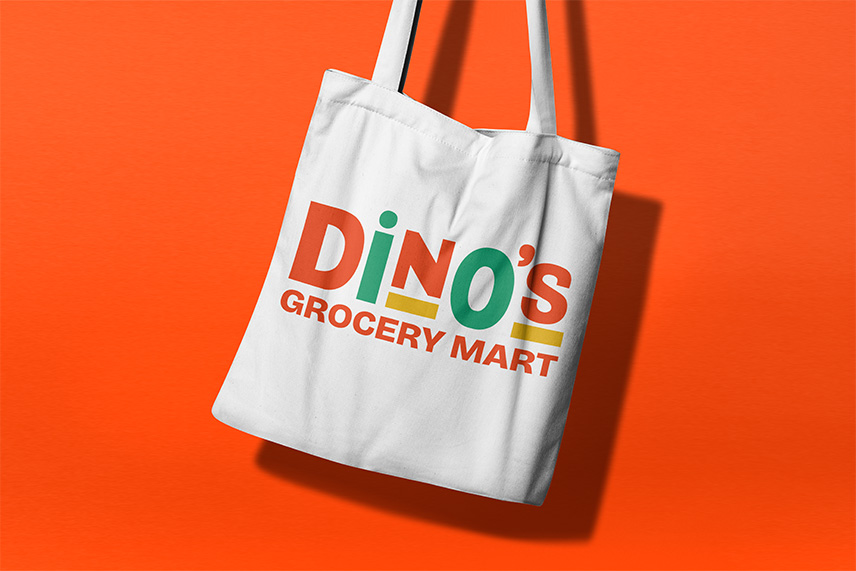
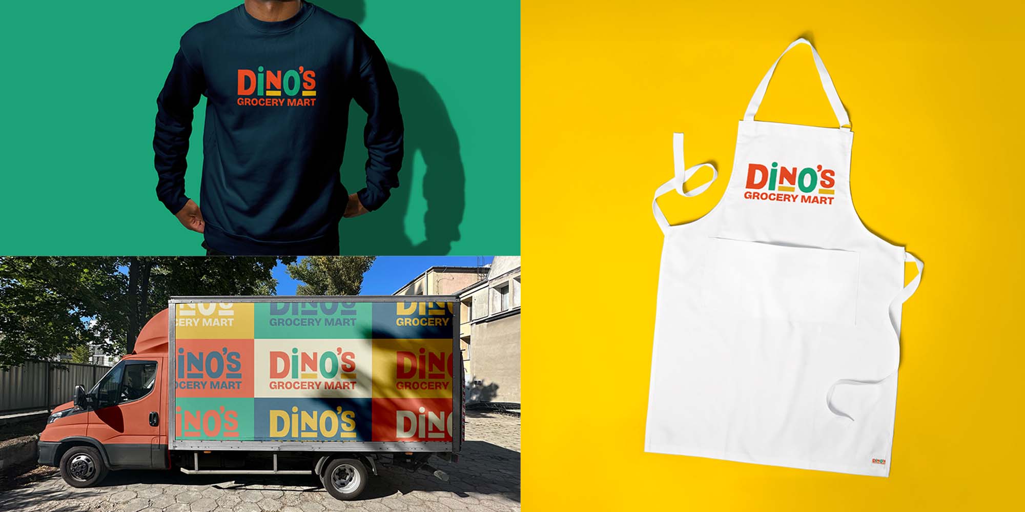
Final Logo Design
Because Dino's serves people from very unique ethnic backgrounds, the new brand couldn't sterilize their customers' cultures by over-simplifying the brand. It needed to focus on what unified the cultures—colour!
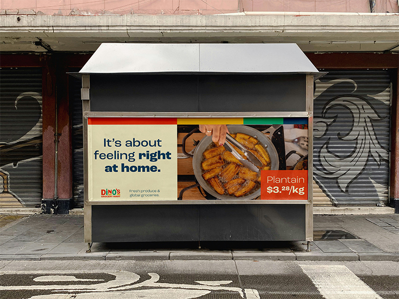
Advertising Campaign Proposal
What Dinos' customers are really looking for is the feeling of home. With this advertising campaign, rather than showing the product that's available at Dino's they could share the final dish that reminds customers of being back home. It best showcases Dinos sensitivity to their customers needs.